Through template optimization, ranges can be better utilized and visibility increased. Not only by 2-3%, but over 50% most of the time.
The most important technical factors for the campaign success of an email marketing campaign are mail graphics and responsive design. Through optimization, existing audiences can be better utilized and campaign visibility increased.
Want responsive Emails with MailBeez?
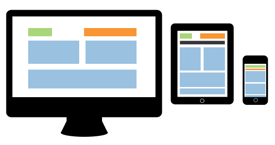 (what are responsive emails?) In combination with the responsive template manager you are able to select a responsive email template for your MailBeez module and adopt them to your design.
The template manager works fully visual and does not require and html or css knowledge – but the nerdmode allows you to edited everything in code mode if you like!
If you consider these two aspects alone in your future planning, you have strong leverage at your disposal to get considerably more out of your existing audiences. And here we are not talking about two, three percentage points in the end result, but rather over 50% and more visibility for your email marketing campaign!
Mail graphics: Modern email clients automatically hide pictures in emails, which results in a situation, where the meticulously created and well thought out layout of the campaign is simply nullified. According to a previous study of the American CRM agency Merkle Inc., only about 48% of recipients automatically see the pictures in the email (and this percentage is currently going down rather than up). Therefore, if you do not take precautionary measures, you risk about half of your recipients receiving empty or white emails at worst and having them completely ignored (or much worse, they are marked as SPAM and your future messages are not delivered directed to this reader’s inbox). Email recipients decide (after the sender’s name and subject have caught the reader’s interest at the initial stage) within a few seconds, whether they will continue to spend time on the male or not. In an overwhelming number of cases, the at first glance “empty” template therefore leads to the inevitable deletion of the email.
In addition you have the fact regarding the display difficulties on the part of the devices: For instance, as the current study of the lab, E-mail 360°, of the BVDW (German Association for Digital Commerce) shows, according to which about 32% of mobile users bemoan both the unsatisfactory display and poor readability of emails on mobile phones, two error factors then converge partially; a template not well prepared technically (no fallback etc.) and no responsive design.
Already small mistakes can have big and not to be underestimated effects on the success or failure of an email campaign and long-term customer interactions.
Now there are several approaches to solving this problem: either you do without pictures as much as possible and use them in those places, where they will not seriously influence the impact of the campaign if hidden by the mail client or – which would be the more elegant solution – you technically organize the email in such a way, that it retains the layout and contains all important information although the pictures are switched off. To achieve this, you need to make extensive use of alternative texts and background colors.
Depending on the time and effort you are willing to invest in creating the mail layout, you can – provided the individual pictures are fitted accordingly – you can broadly go over the whole layout, so that there is hardly any difference between the pictureless version and the version with pictures. You could take it to the limit and completely do without pictures by realizing all design elements with the help of style sheets. The advantage of a technically well implemented is obvious – in the first four to five seconds, that a receipt on the average spends on “scanning” a message in the inbox, you can call particular attention to your campaign and arouse interest, while the possibly not so well structured emails of your rivals fade out.
Also not unimportant in the technical aspect is the change in the reading behavior of recipients. With the emergence of smartphones and tablets, the number of recipients, who open emails on mobile devices, has increased significantly. According to a current study of the leading company in the field of email intelligence, Return Path, about 40% of recipients open their emails on smartphones or tablets nowadays, which is a strongly increasing trend (in individual cases, we have already measured up to 80% during customer campaigns). Now it is obviously also dependent on the composition of the mailing list, to what extent mobile devices should be considered. With an older target group, the percentage might be higher than with a younger target group – the advertiser must also decide, based on analyses of the mailing lists, whether investing in mobile-optimized campaigns will pay off or not. Generally, it is advisable to have additional resources ready. Also here you can utilize further audience potentials relatively easily.
Mobile-optimized campaigns improve not only opening and click rates, but also conversion – provided the landing page is also optimized for mobile devices, or rather provides a direct link to download the app (corresponding to the smartphone of the user). The technical implementation proves to be time-consuming however, since apart from the classic client PC with a known resolution, further devices with partly unknown resolution have to be considered. The current implementation is responsive design. Responsive emails automatically adapt to the given resolution of the device and give the advertiser the opportunity to serve the email to his reader in a reader-friendly manner.
If you go a step further, you can even influence the content of the campaign to a certain level thanks to responsive design. An example of this is a campaign, in which an advertiser wants to bring smartphones to the recipients. Here common sense already tells you, that it is highly probable, that a recipient, who opens the email on a smartphone does not urgently need a smartphone. Lost potential, some would now say. But with a responsive design, which can turn content blocks on and off according to the resolution, potential can also be utilized from a smartphone owner – because instead of the smartphone deal, you can display a tablet offer as an alternative, as it is received by the individual device and for instance offers a new version of it. Dynamic HTML contents (or premium class realtime mail marketing) is the the magic word here and certainly one of the trends in 2014.
“Most people use online media today by scanning contents at lightening speed. The more successful you are at arousing interest spontaneously, the more successful your campaigns will be”, this was the opinion expressed by Dr. Torsten Schwarz in an article just at the beginning of this year. And I couldn’t have summarized it better than this at this point. When all is said and done, somewhere also dating back to the ancient (#funny  ) saying and incidentally the title of an “online bible”, “Don’t make me think!“
The bottom line is, you can solve some problems in the technical aspect of an email, that can otherwise have a catastrophic effect on the success of the campaign. Fallback designs and responsive emails are good measures to increase click rates – but at the same time you must be aware that each measure has one requirement: technically flawlessly implemented programming. Browsers like Chrome, Firefox, and Opera may pardon smaller programming errors on websites – email clients are merciless however and every small error in the source code can lead to unforeseen problems. Thus – also for all technical finesse – one thing applies during the creation of a campaign: Testing, testing and more testing – not only regarding the deliverability but also regarding the display on devices.
Want responsive Emails with MailBeez?
(what are responsive emails?) In combination with the responsive template manager you are able to select a responsive email template for your MailBeez module and adopt them to your design.
The template manager works fully visual and does not require and html or css knowledge – but the nerdmode allows you to edited everything in code mode if you like!
posted by Jan-Philip Ziebold on http://www.email-marketing-forum.de/Fachartikel/details/1406-Templates-optimieren-Grafiken-und-Responsive-Design/46063